Bean

Bean

Aug 2023 - Sep 2023
Designing a Medication Reminder App
UX Designer
Figma
bean final present image
Bean is a medication reminder app for individuals who often forget to take their medication. It enables people to keep track of their medication as well as the medication of their loved ones. The app also tracks analytics and reports on progress over time.

The Problem

Design an app that will improve individuals’ health by managing their medications and better their understanding of how to properly take them.

The Goal

‍In the United States, 75% of Americans have difficulty taking their medicine as prescribed (National Library of Medicine).

Overview

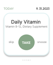
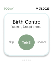
I utilized statistics on medication from the U.S. population to develop interview questions. Many participants admitted that they often took their medication late due to the busy nature of their lives. The results from the research showed that it would be beneficial for users if they had assistance in reminding them.

User Personas

user persona for angela
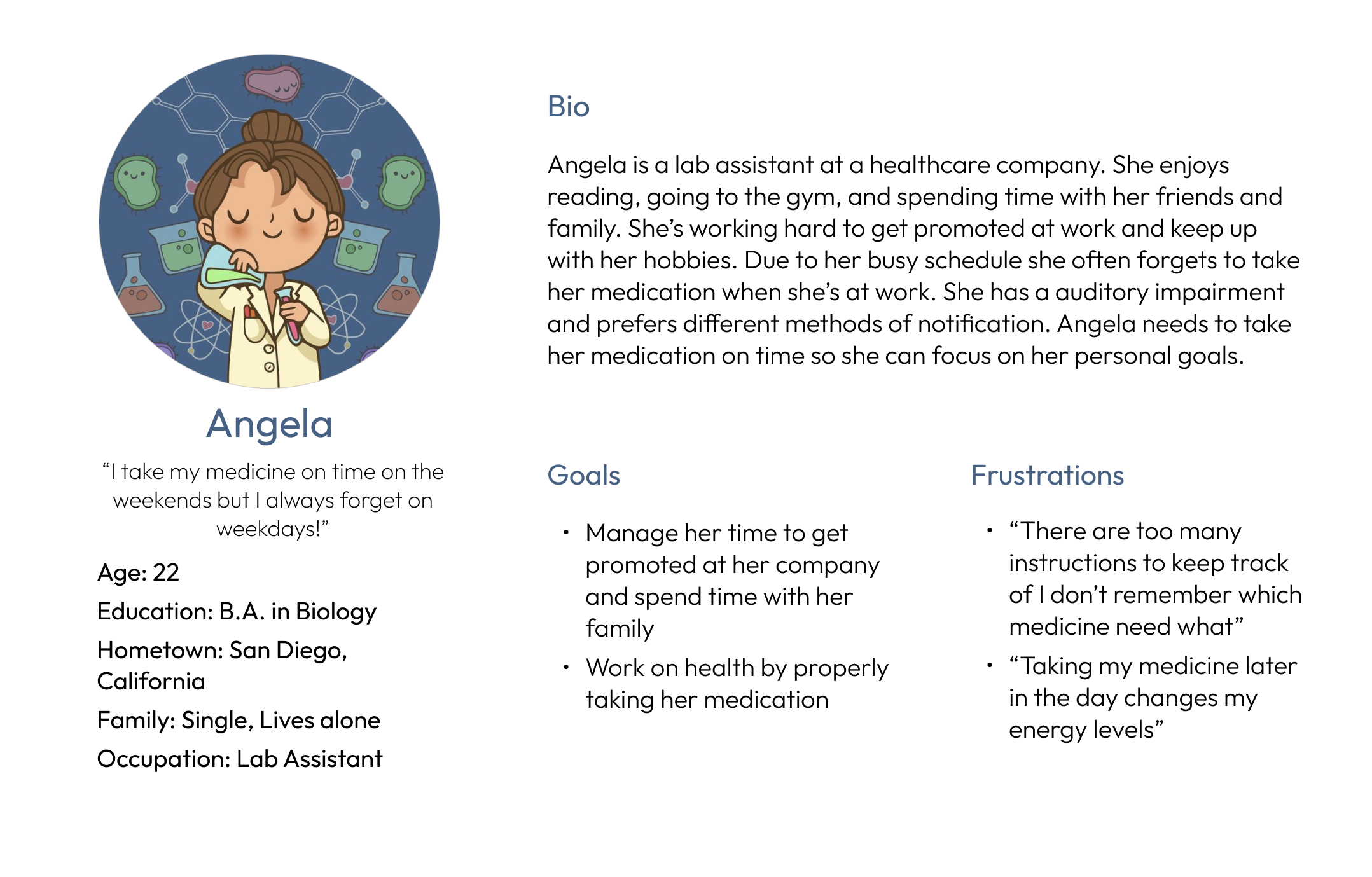
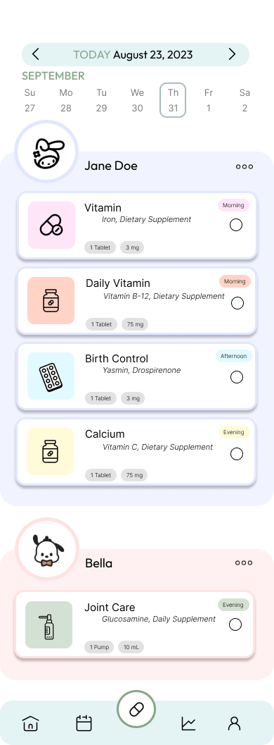
Problem Statement: Angela is a hardworking lab assistant who needs reminders and instructions to take her medicine on time because she has a busy routine and wants to improve her health. 
user persona for ethan
Problem Statement: Ethan is the lead architect and primary caretaker of his elderly mother and kids who needs an organized system to manage everyone’s medication because he’s often confused and can’t afford to hire anyone to help him.
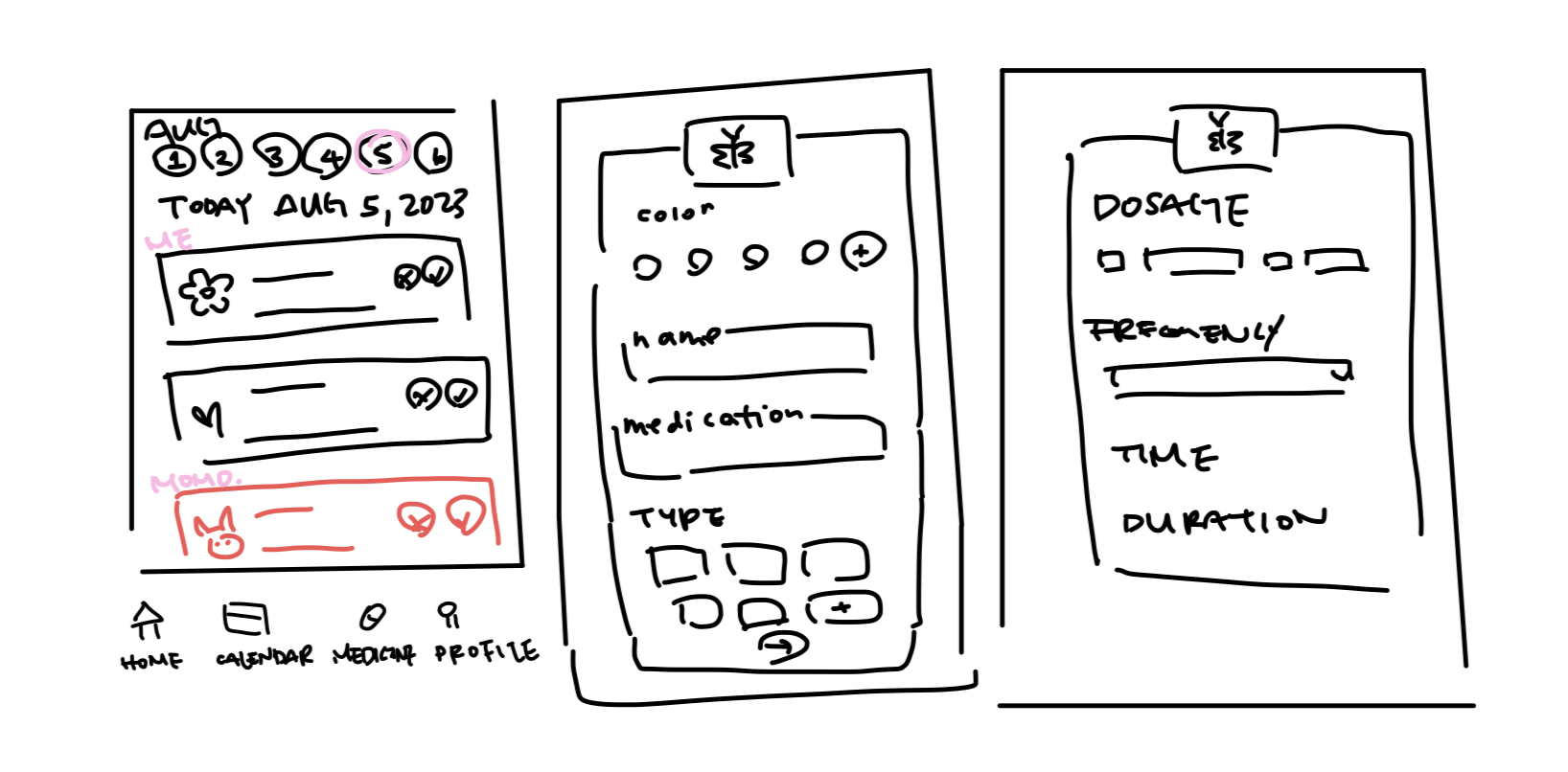
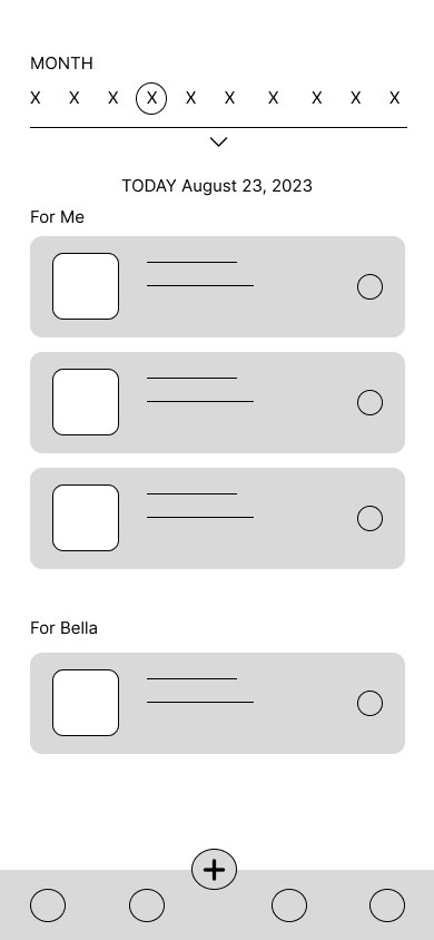
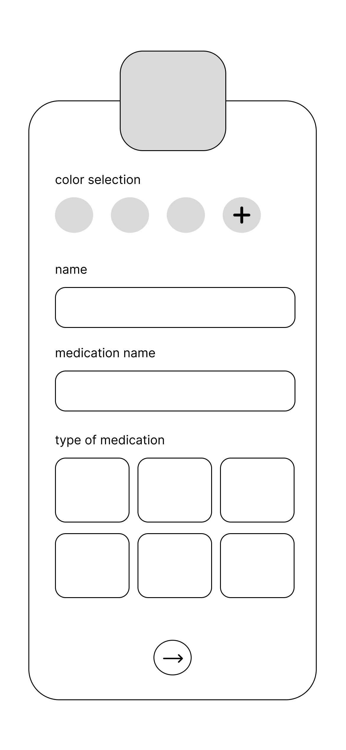
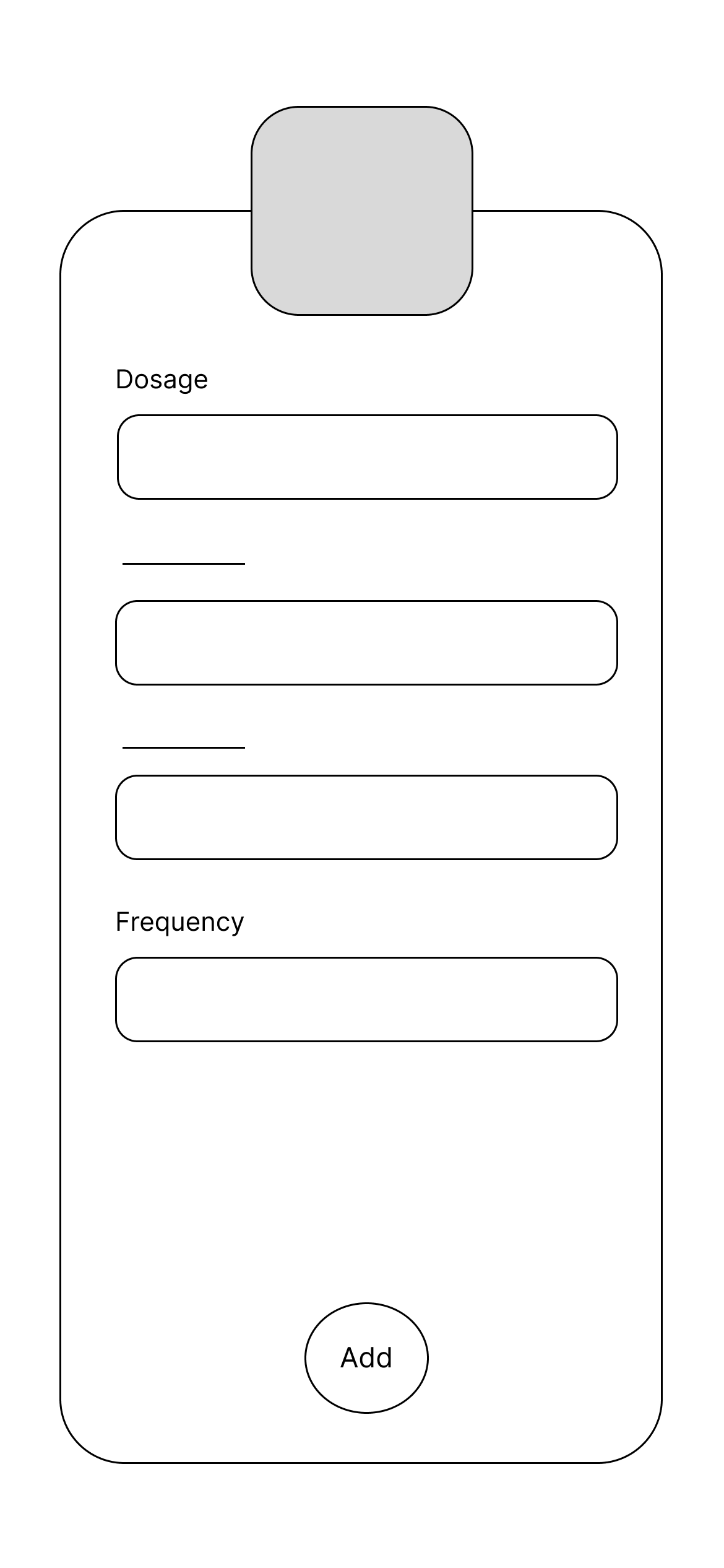
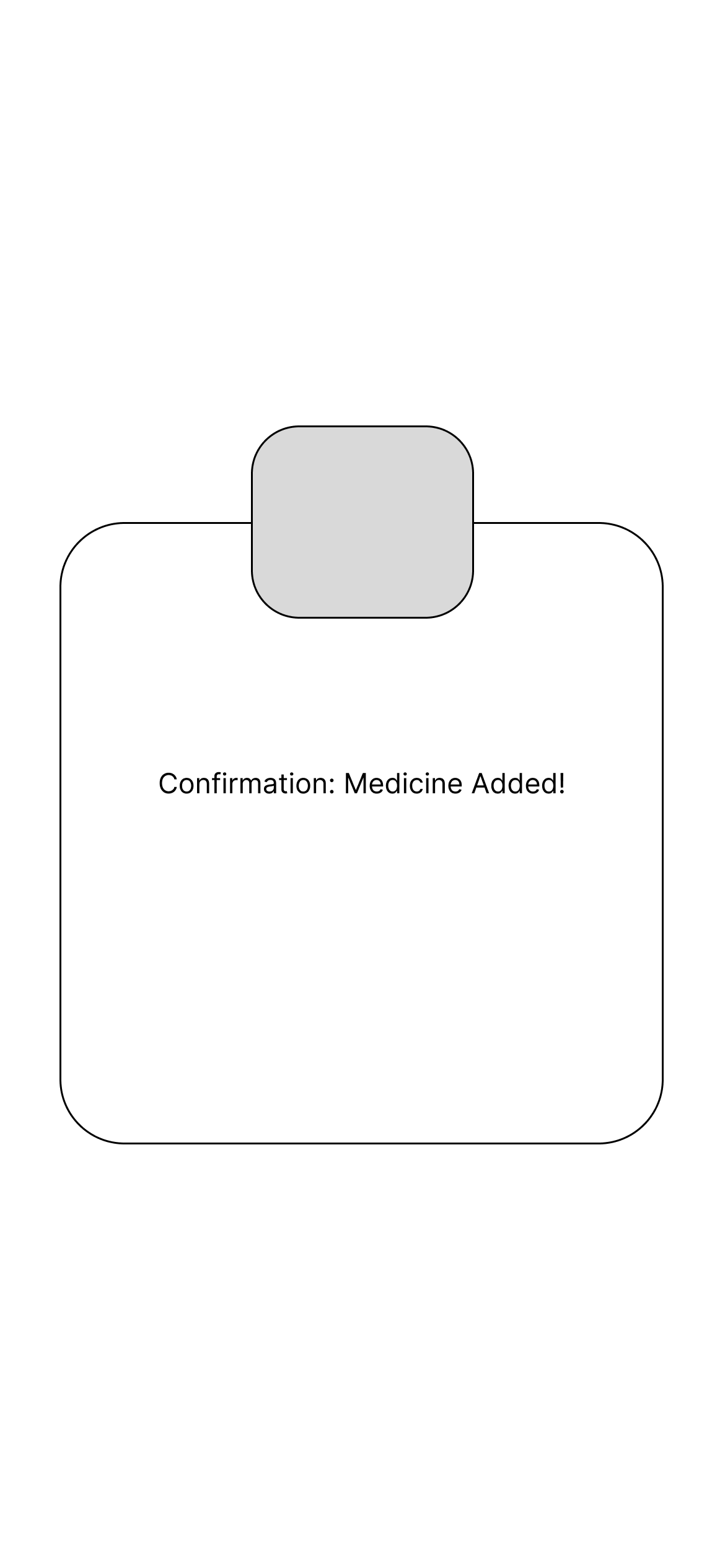
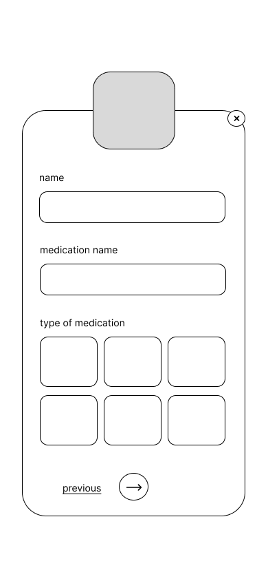
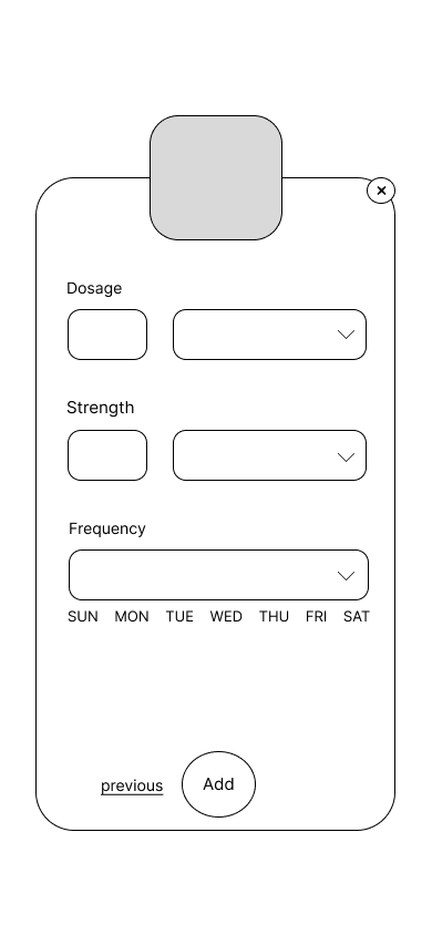
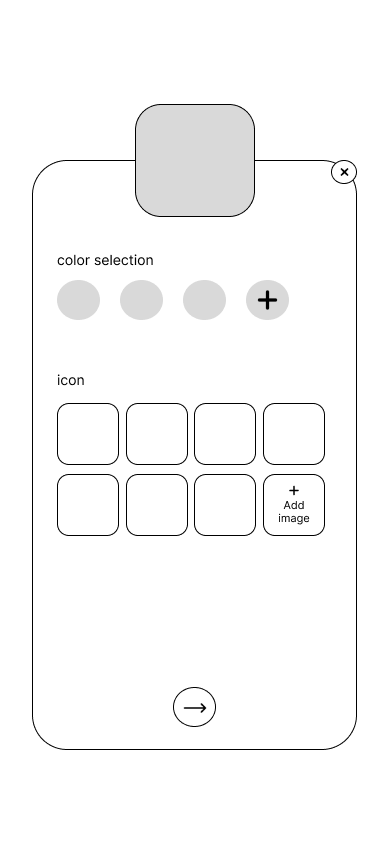
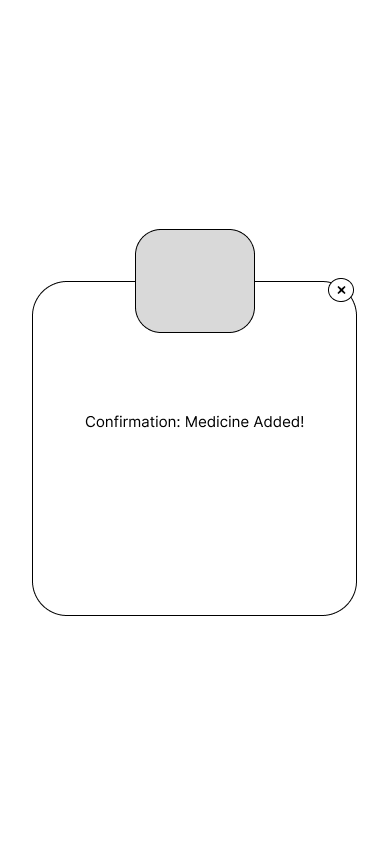
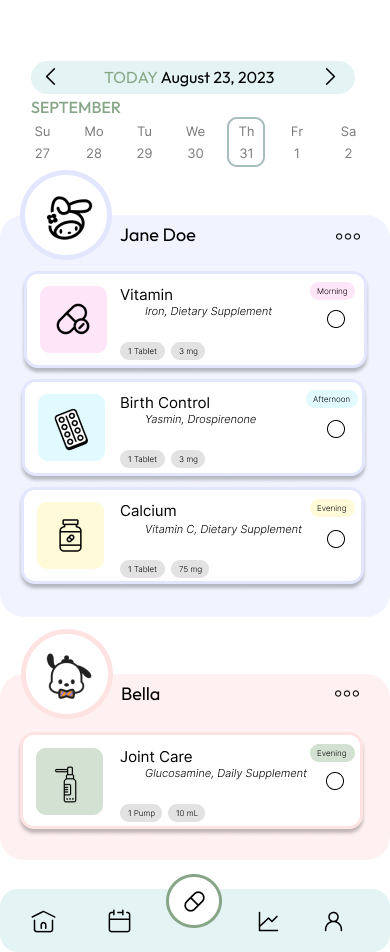
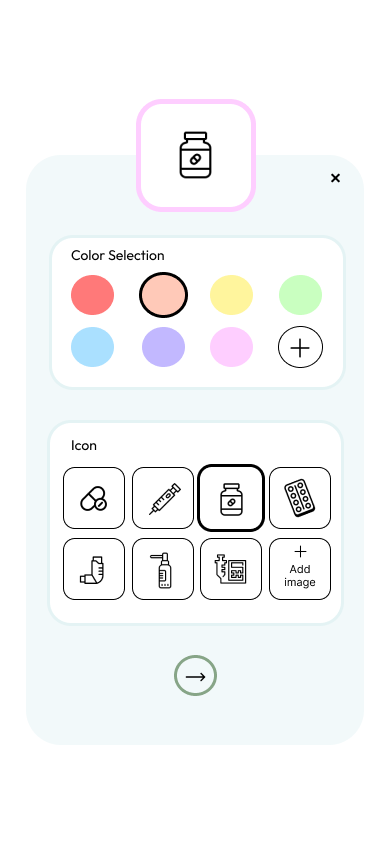
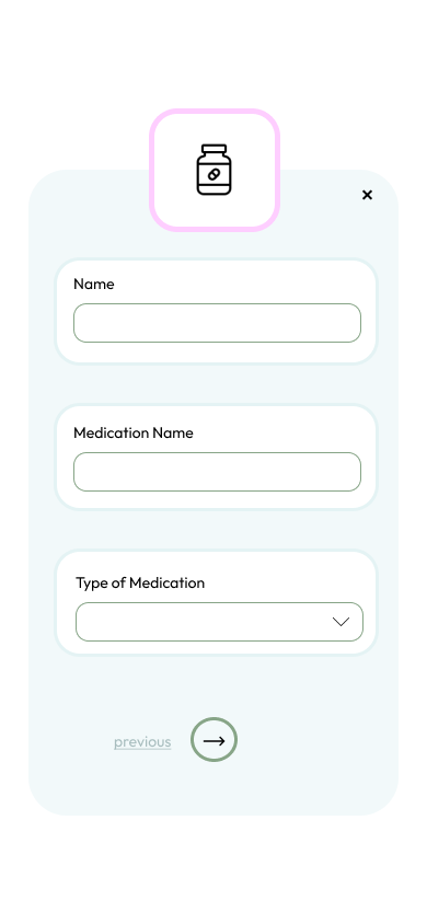
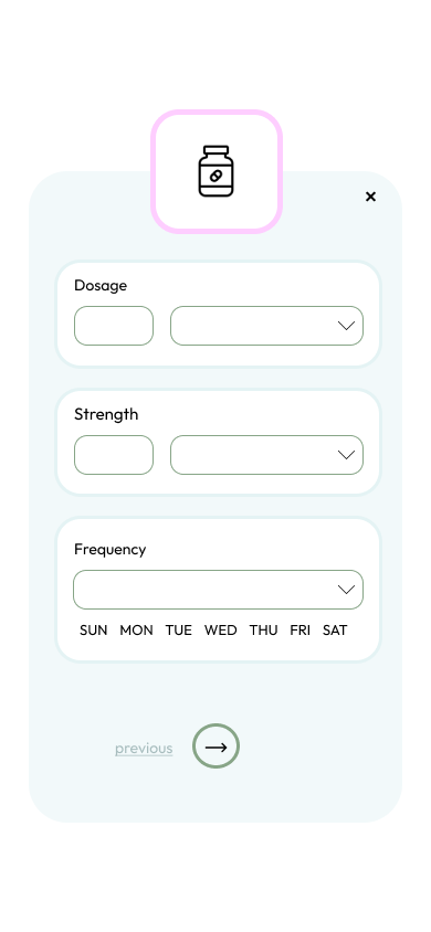
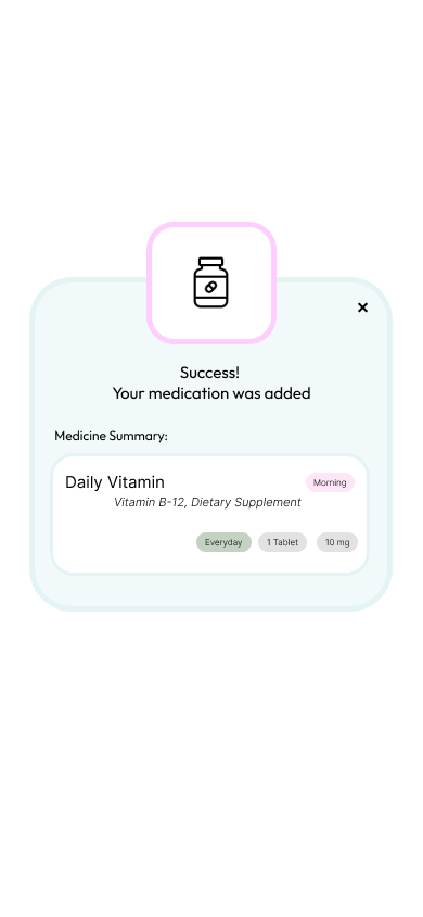
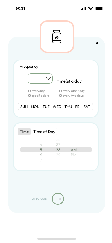
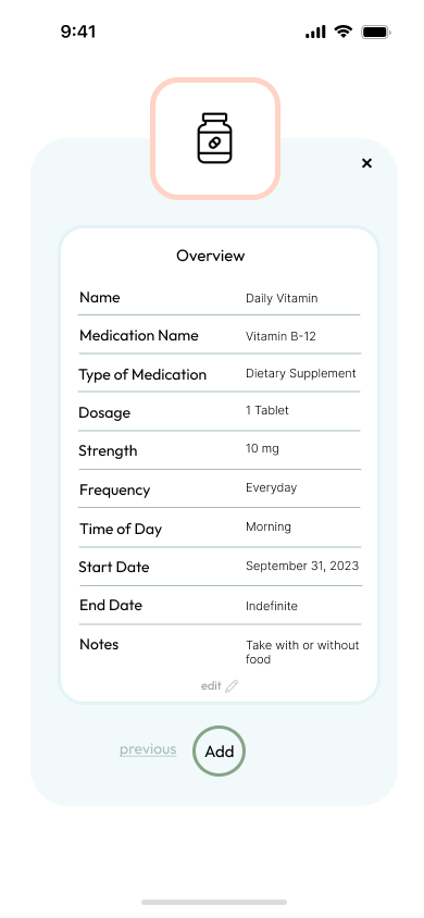
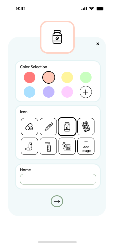
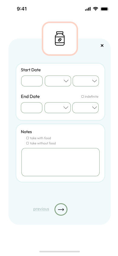
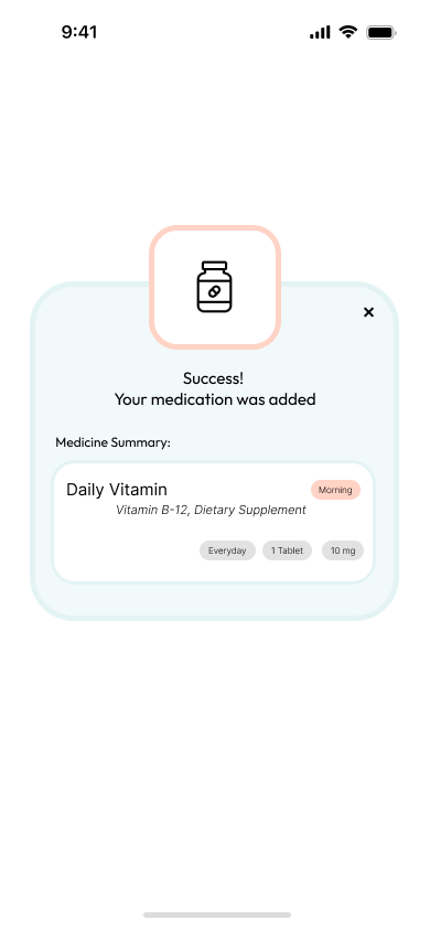
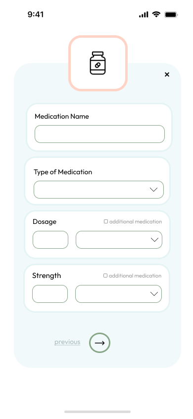
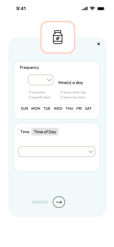
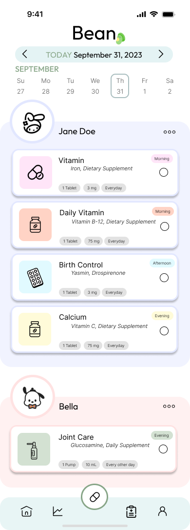
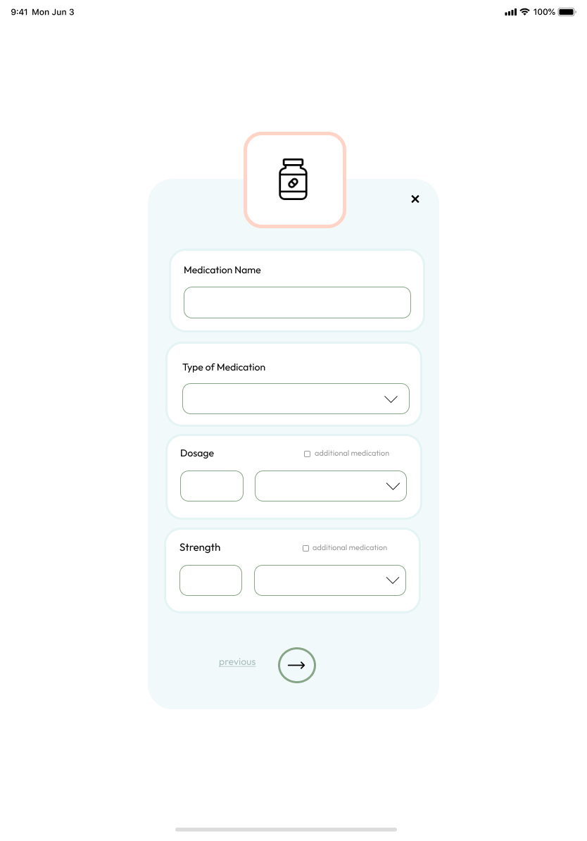
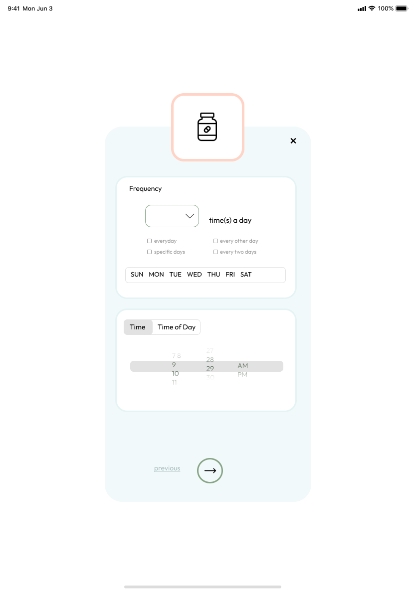
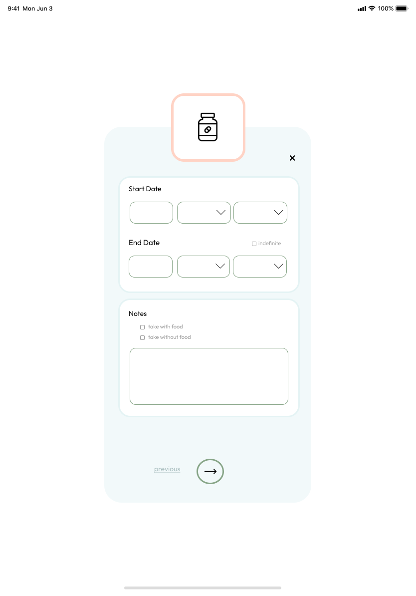
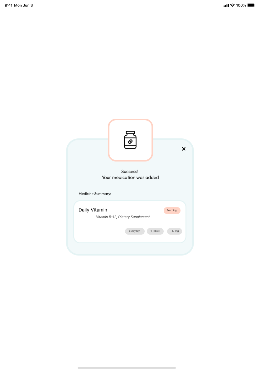
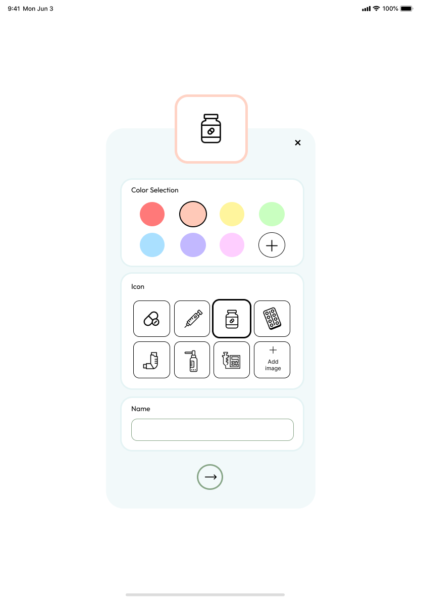
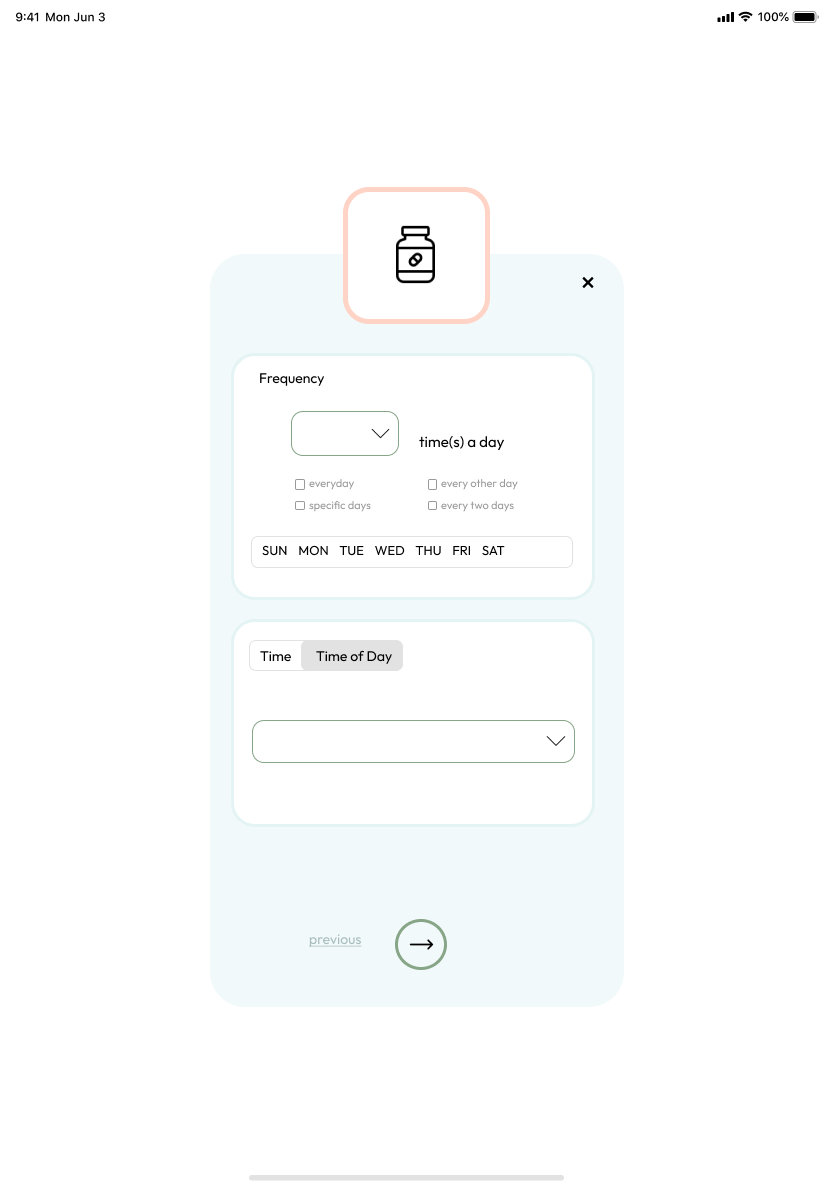
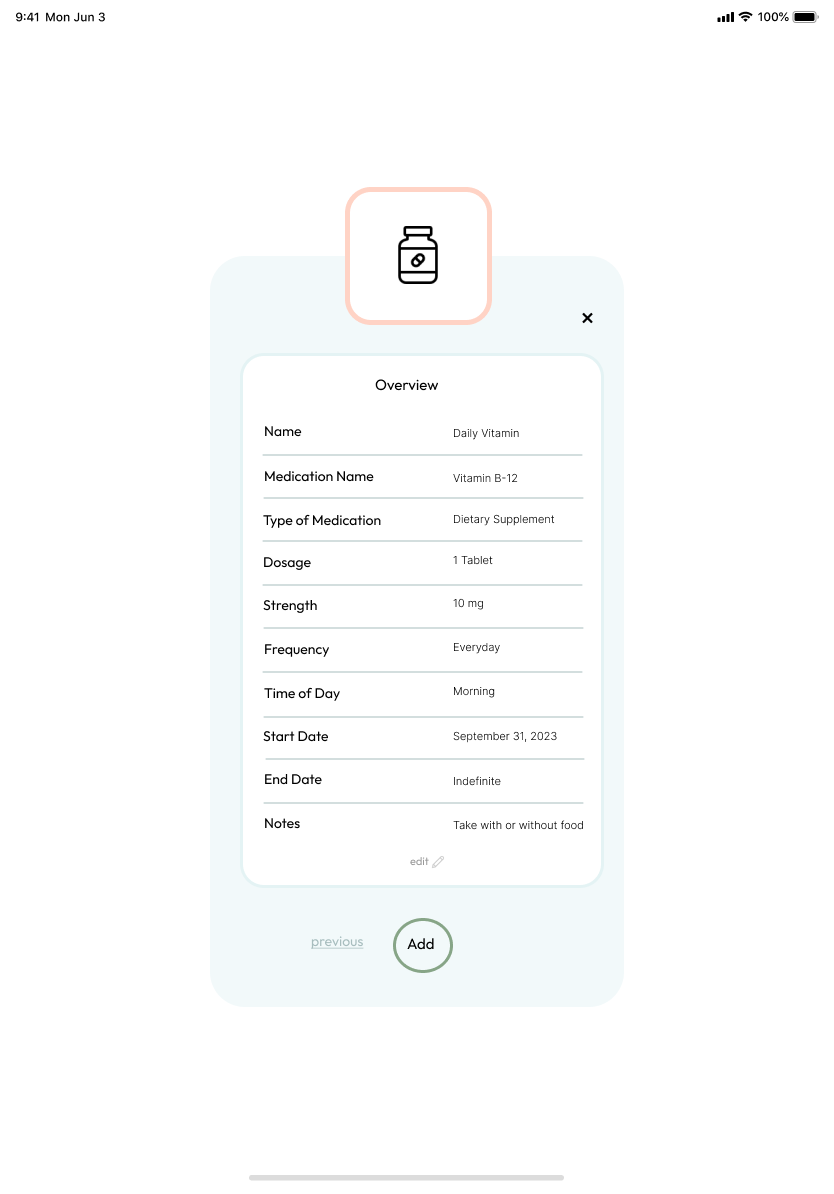
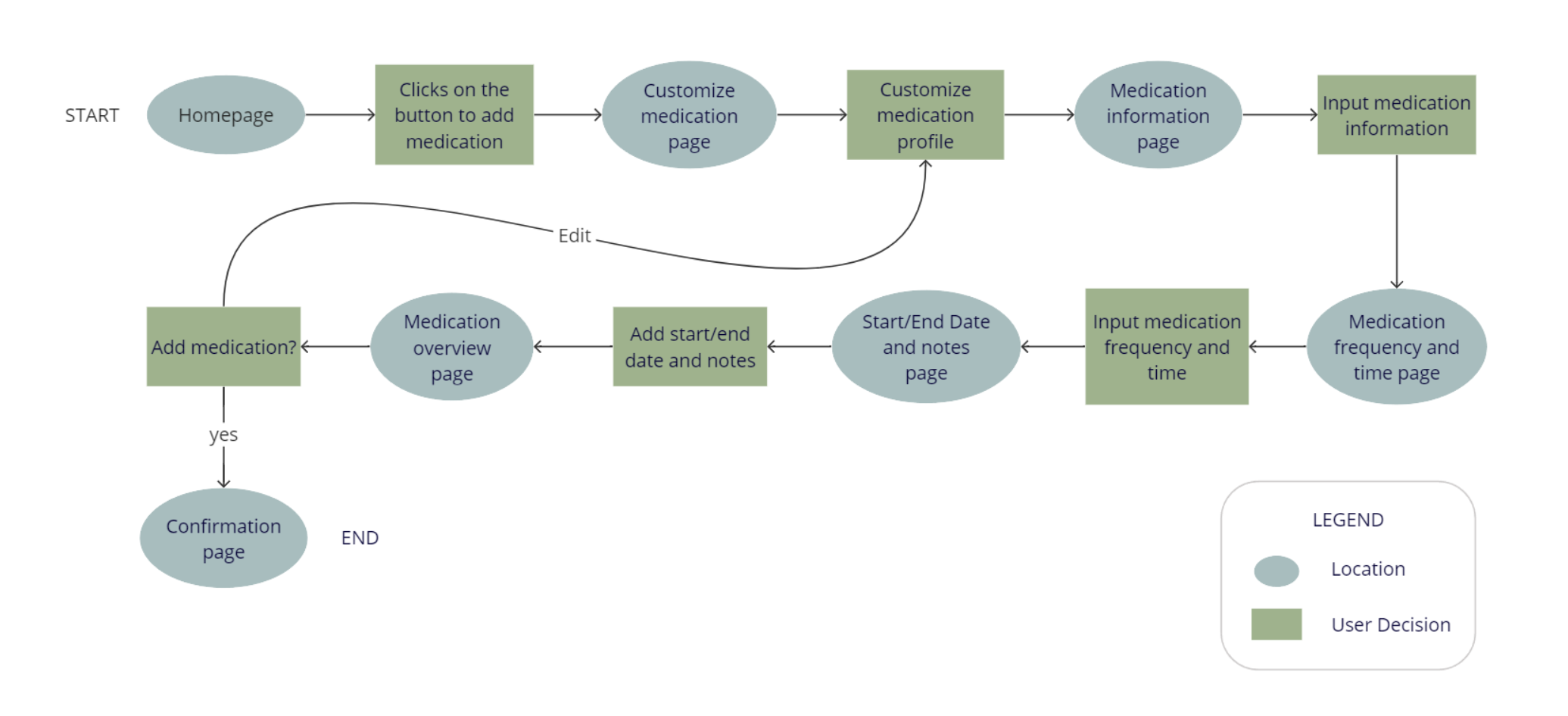
User Flow

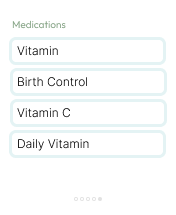
I mapped out the user flow for adding a new medication.
user flow for a medication app
I audited several highly-rated competitors that highlighted some of the gaps and opportunities for the Bean app.
competitive analysis for 4 different companies competitor analysis for 4 different companies
After mapping out the user flow and conducting a competitive audit, I did a variety of sketches of what the app would eventually look like. I prioritized simplicity and would eventually come to realize that I didn't sketch out key pages that I needed.
sketched paper wireframes
After iterating on paper wireframes, I created digital wireframes for the Bean app. The home page is geared towards users managing medication for themselves and any other individuals in their care. I also added a confirmation page to show users that their medication was added.
homepage digital wireframe
medicine customizer digital wireframe
customize medicine digital wireframe
confirmation page digital wireframe
After iterating on paper wireframes, I created digital wireframes for the Bean app. The home page is geared towards users managing medication for themselves and any other individuals in their care. I also added a confirmation page to show users that their medication was added.
View Low-Fi Prototype
app analytics digital wireframe
homepage digital wireframe
medicine customize page digital wireframemedicine customize page digital wireframe
medicine customize page digital wireframeconfirmation page digital wireframe
The insights from the usability study prompted me to make several changes. I made the profiles and the buttons for adding medication more prominent. 
homepage mockup
medicine customize page mockupmedicine customize page mockup
updated homepage mockup
Study Type
Unmoderated usability study
Location
USA, remote
Participants
5 participants
Length
15-30 minutes

Key Findings

These were the main priorities that users pointed out:

1. Buttons

Altering buttons and making them more apparent 

2. Add Medication Feature

Splitting up medication processes to be more seamless 

3. Navigation

Navigation needs to improve with different features (back buttons, exit buttons)
usability study notes
After the usability study, I decided to change the following items:

1. Adding a tab to show users the frequency of their pills

2. Splitting up the process to add medication because the initial process was too cluttered and not specific enough

3. An overview page so users can edit before submitting

4. Component for 'time of day'  so users can be reminded at a specific time or time of day

5. Start and end day for medication

6. Better frequency table for users who take multiple pills a day, every other day, etc.

Mobile

main page final mobilemobile analytics page final design
homepage final mobilemobile medication customize page final designmobile medication customize page final design
mobile medication customize page final designmobile medication customize page final designmobile confirmation page final design
mobile medication customize page final designmobile medication customize page final designmobile updated homepage final design

Tablet

tablet main page tablet analytics pagetablet medication customize page
tablet home pagetablet medication customize pagetablet medication customize pagetablet confirmation page
tablet medication customize pagetablet medication customize pagetablet medication edit pagetablet updated homepage

Watch

watch main pagereminder to take medication for watchreminder to take medication for watchreminder to take medication for watchreminder to take medication for watchmedications for watchsuccessfully taken medication for watchsuccessfully taken medication for watchsuccessfully taken medication for watchsuccessfully taken medication for watch
View Final Prototype

or view above!

What I learned:

Although the concept of “medication reminder” initially seemed simple, I was surprised to learn how intricate it actually is. There are so many different types of medications and schedules that I oversaw. It was a great challenge and I had to constantly iterate my designs to find the best solution for all users.

Next Steps

1. Conduct research on the app's effectiveness in reminding users to take medication and if it is beneficial for caretakers of children, the elderly, pets, etc.

2. Provide metrics that users can use to track their progress over time.

3. Add resources for users the opportunity to get medication at a reduced price
carrot icon