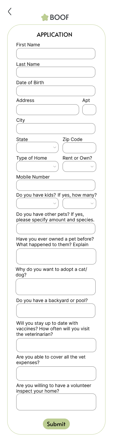
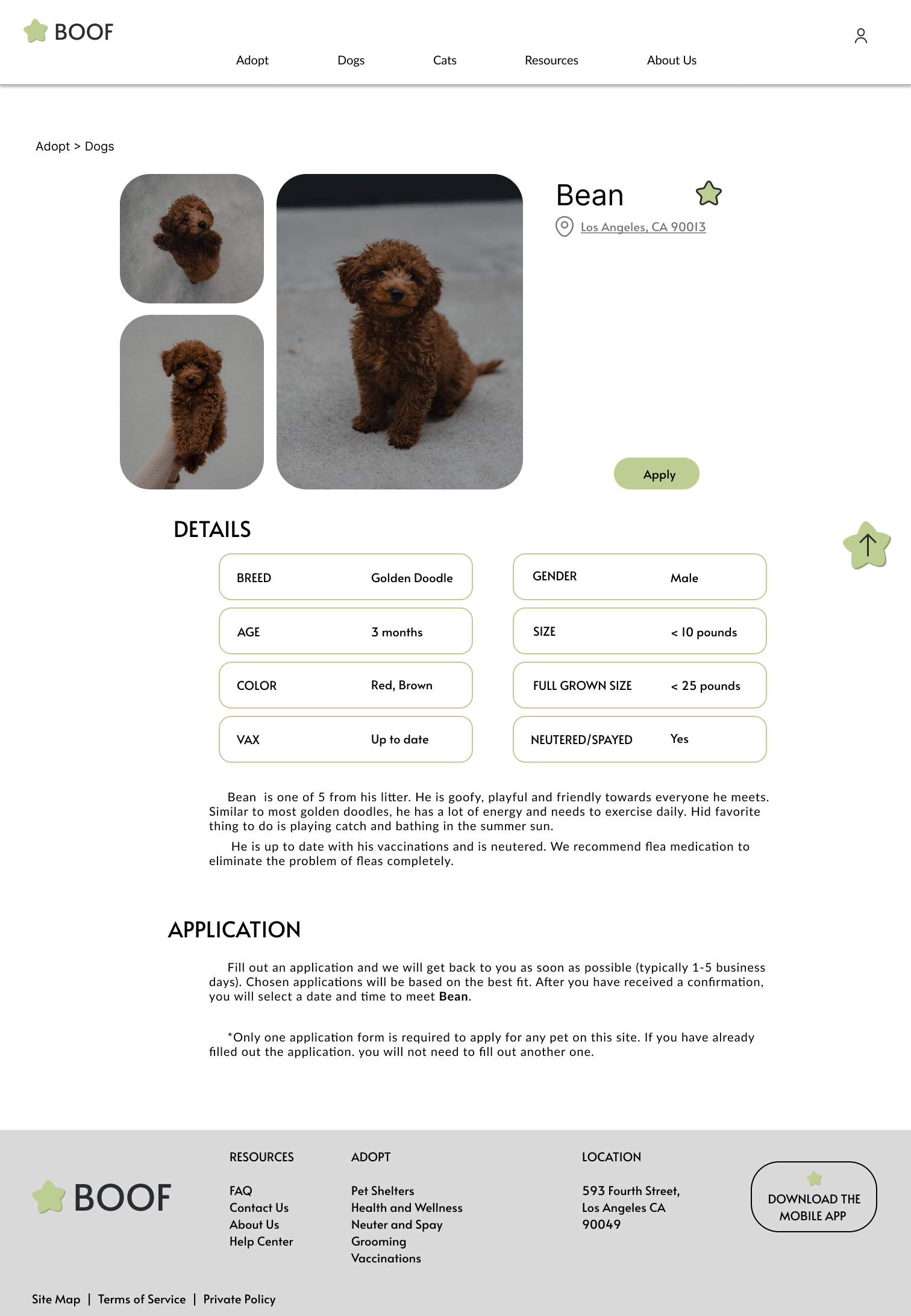
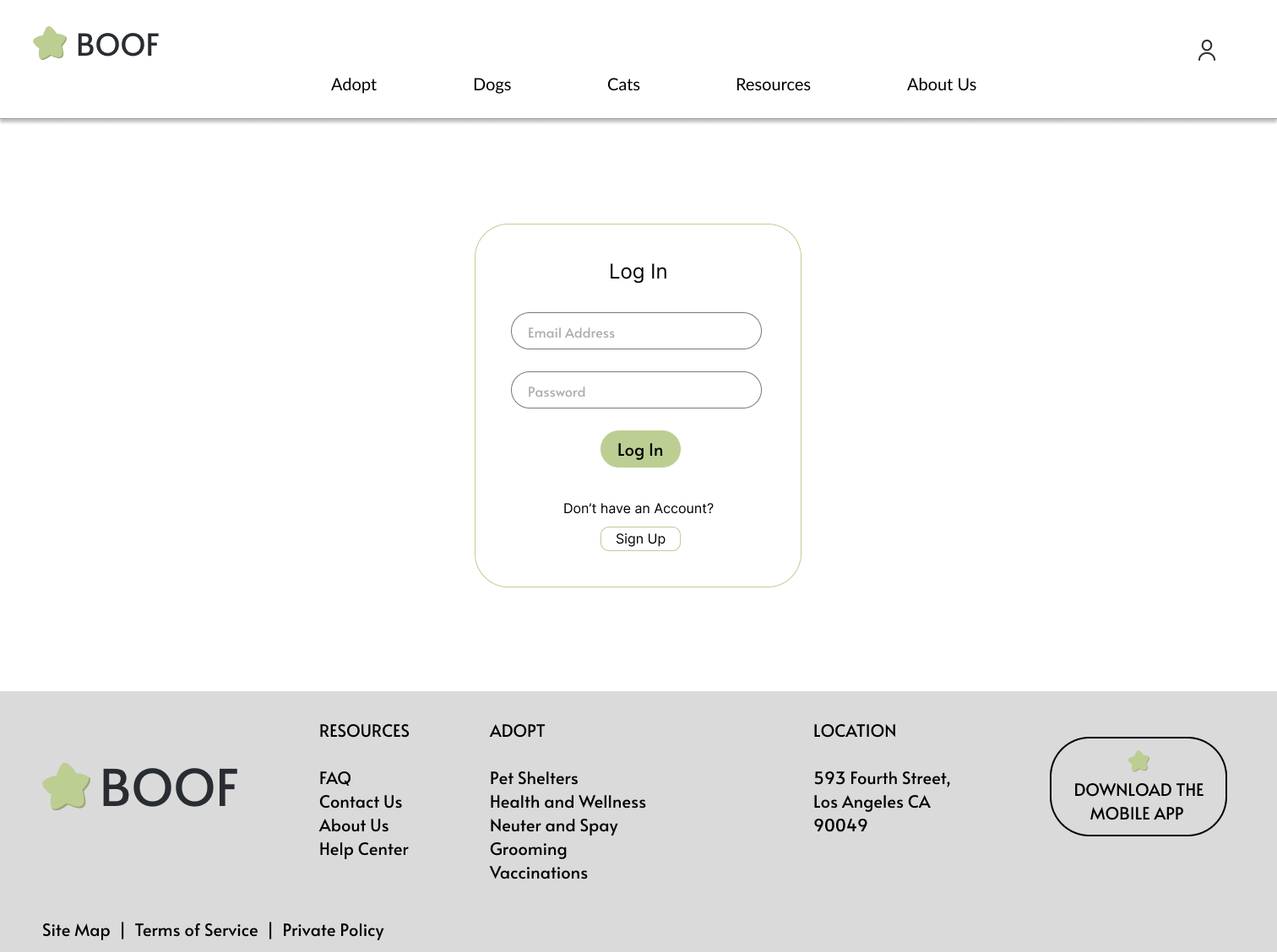
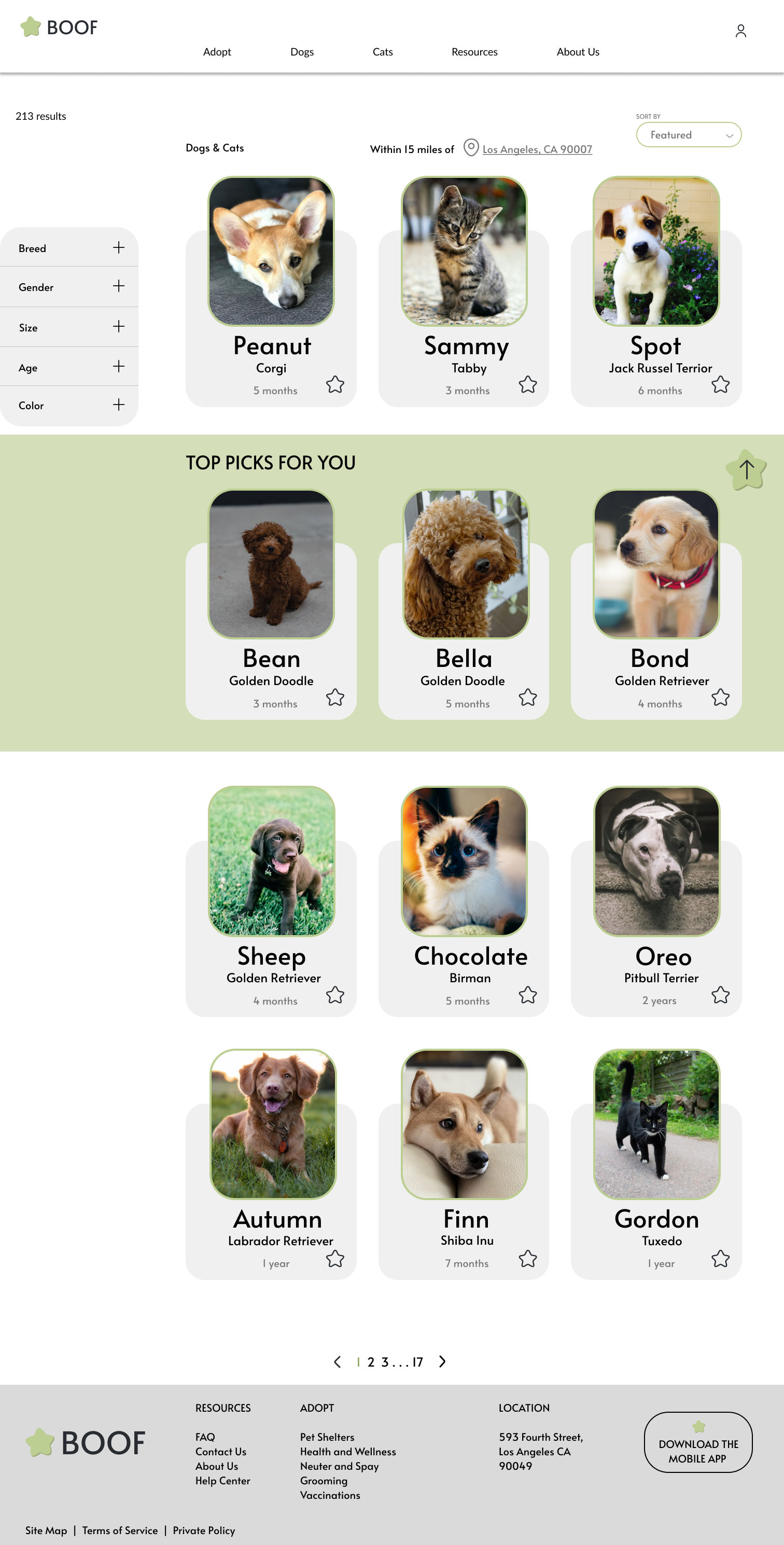
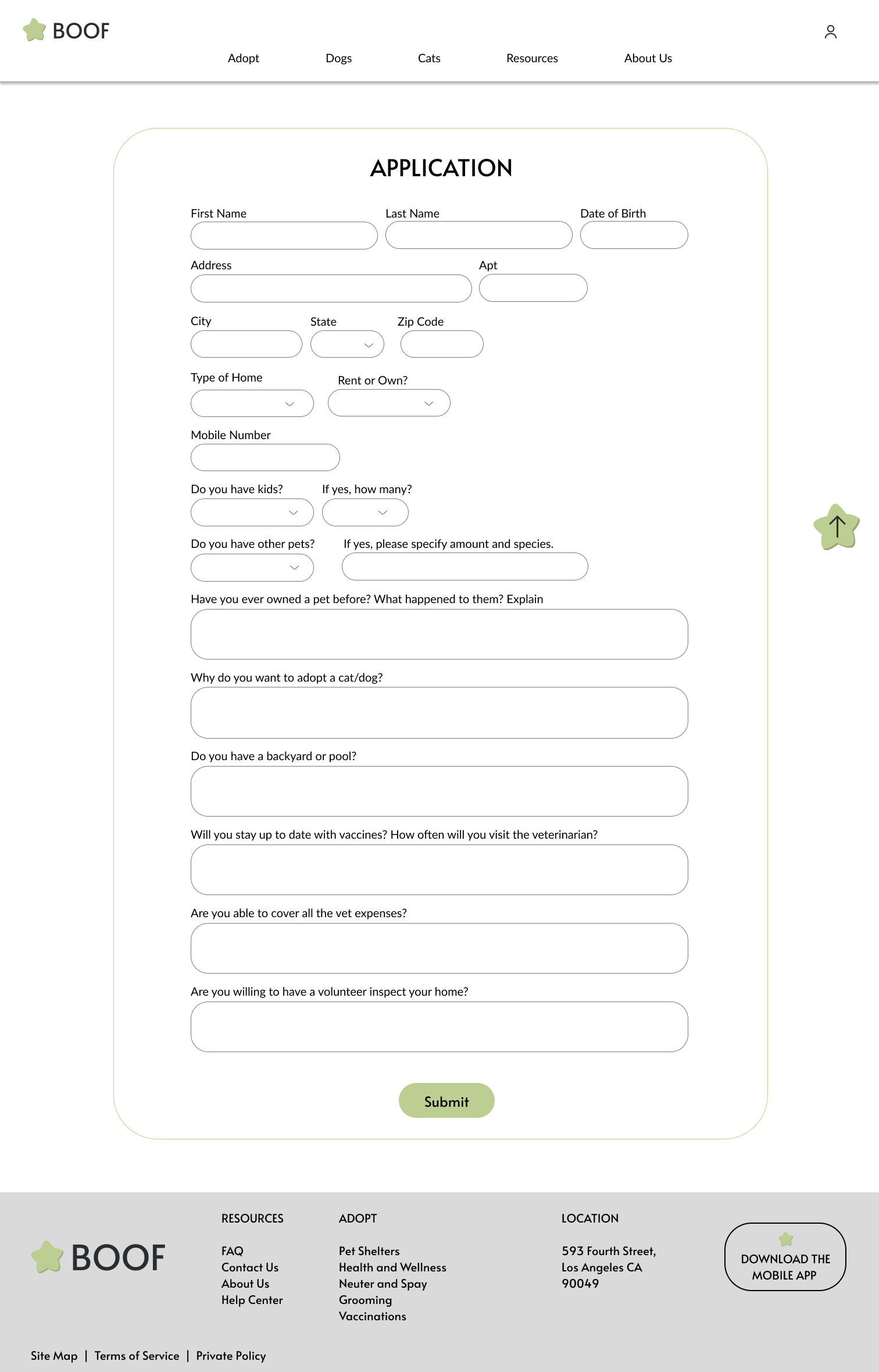
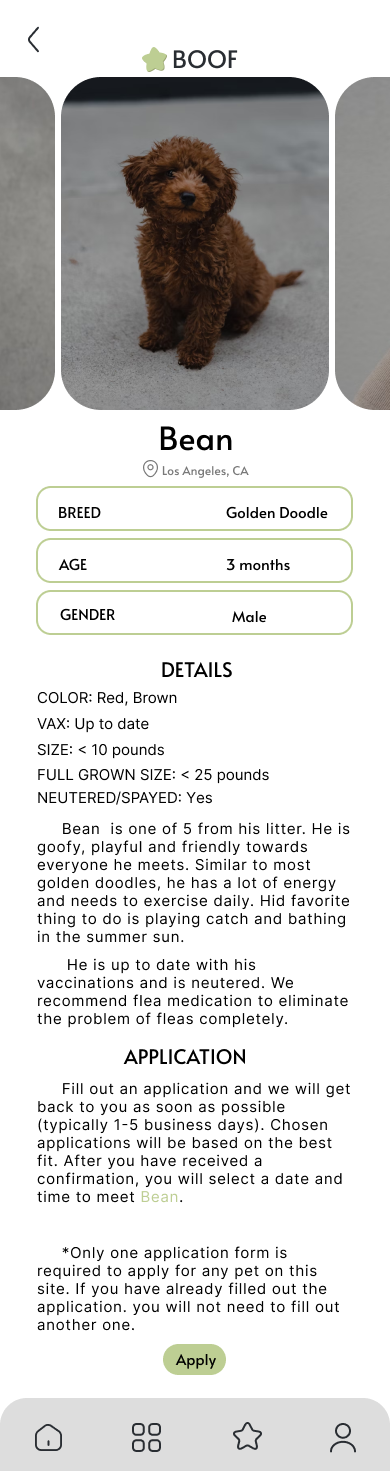
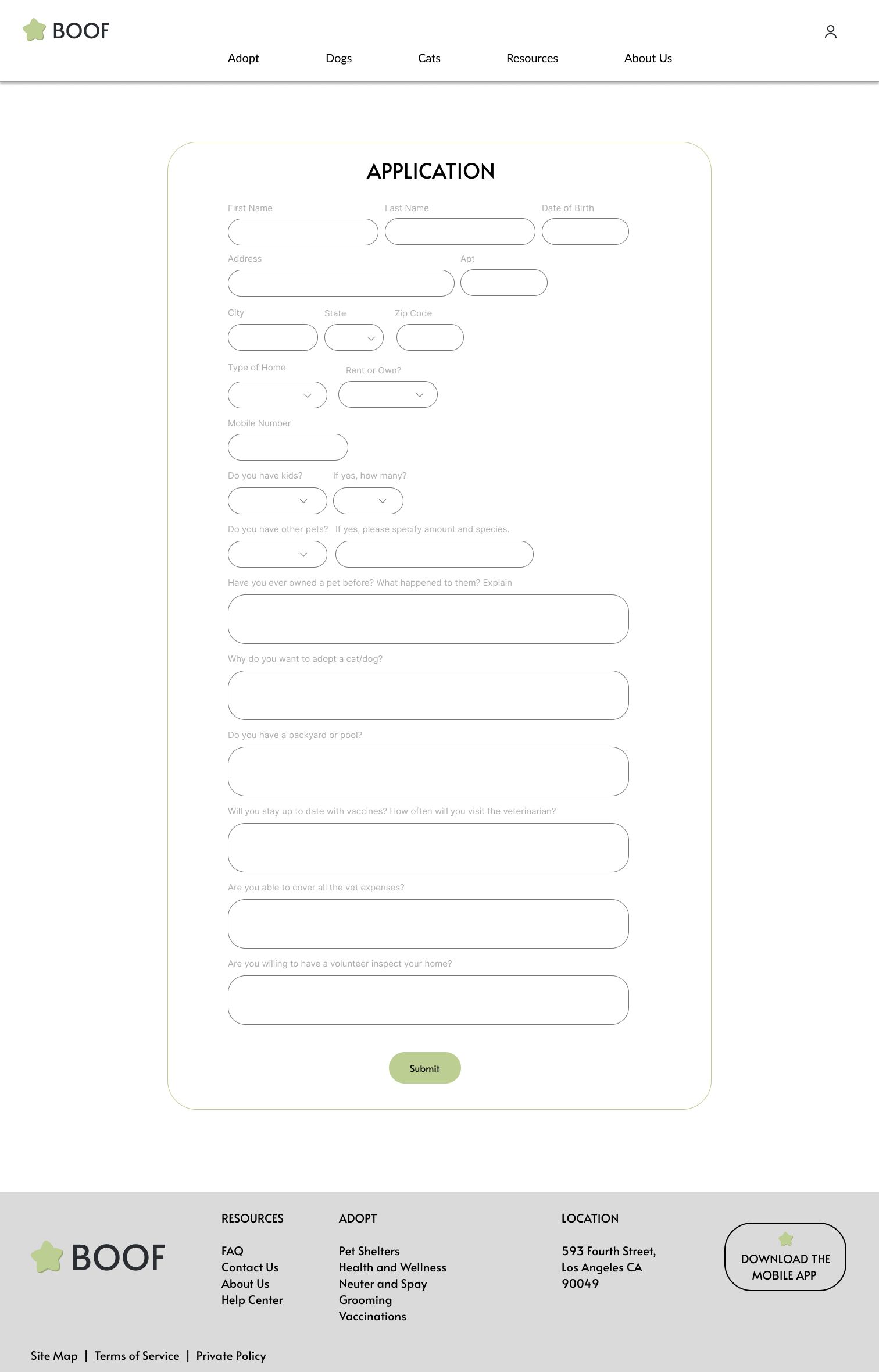
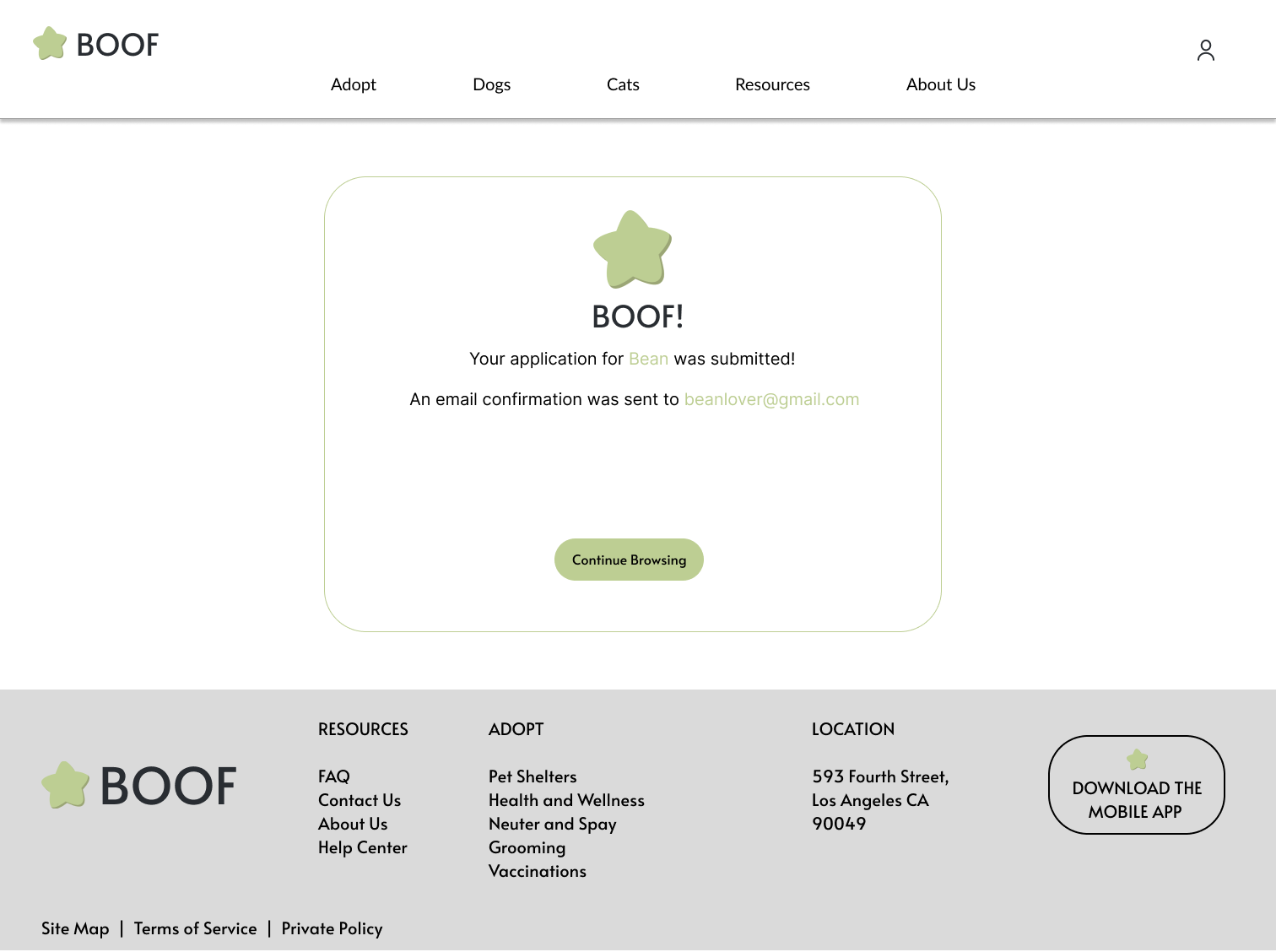
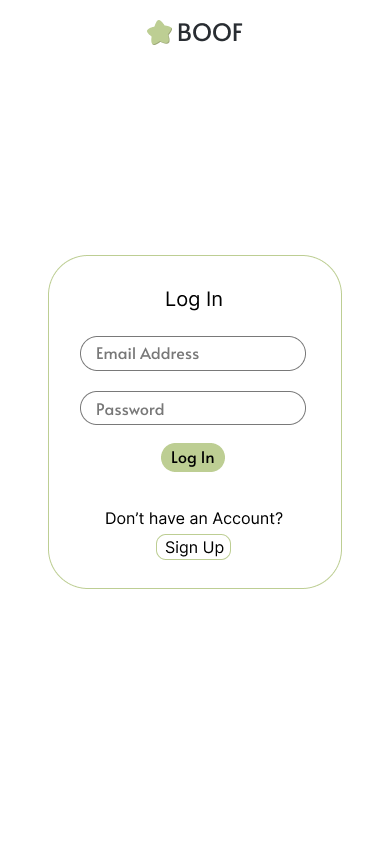
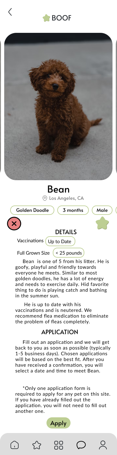
Study Type
Unmoderated usability study
Participants
7 participants
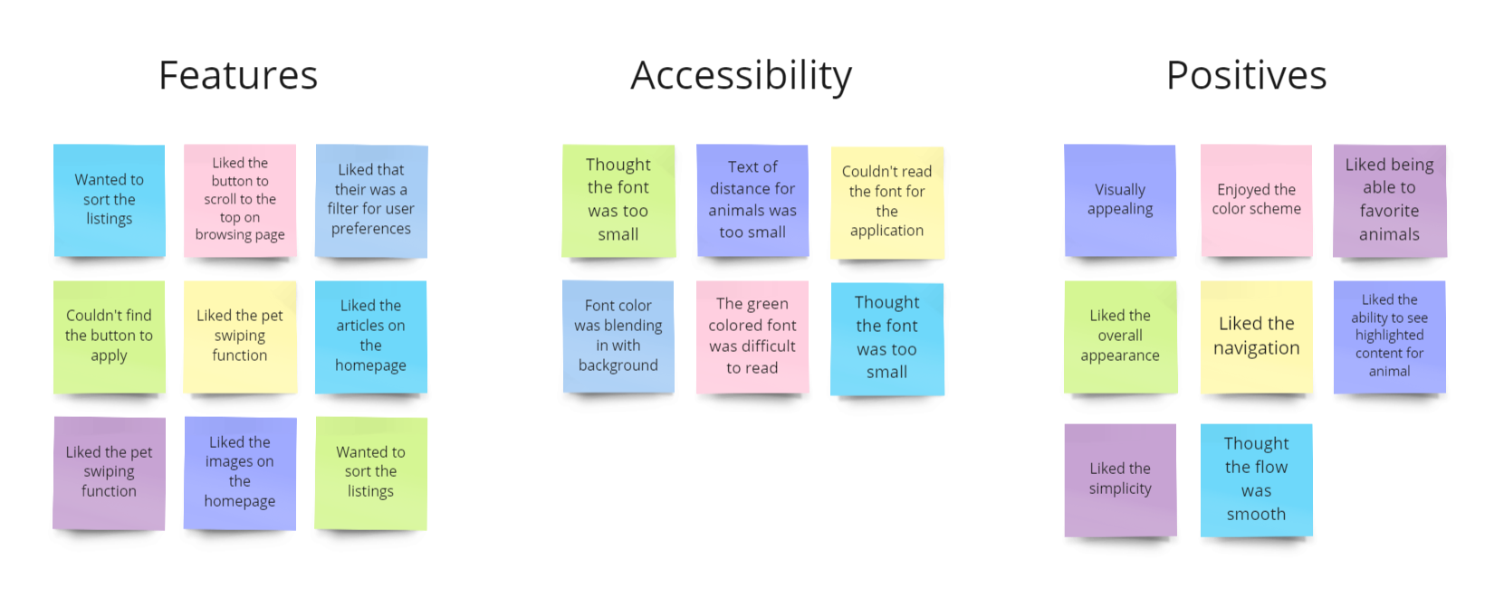
Key Findings
These were the main priorities that users pointed out:
1. Font
Especially on mobile, the font did not meet accessibility standards in terms of color or size for some of the descriptions.
2. Filter Features
Users wanted another filter function for more efficient browsing
3. Color and Opacity
Images were too transparent and distracted users during the browsing process
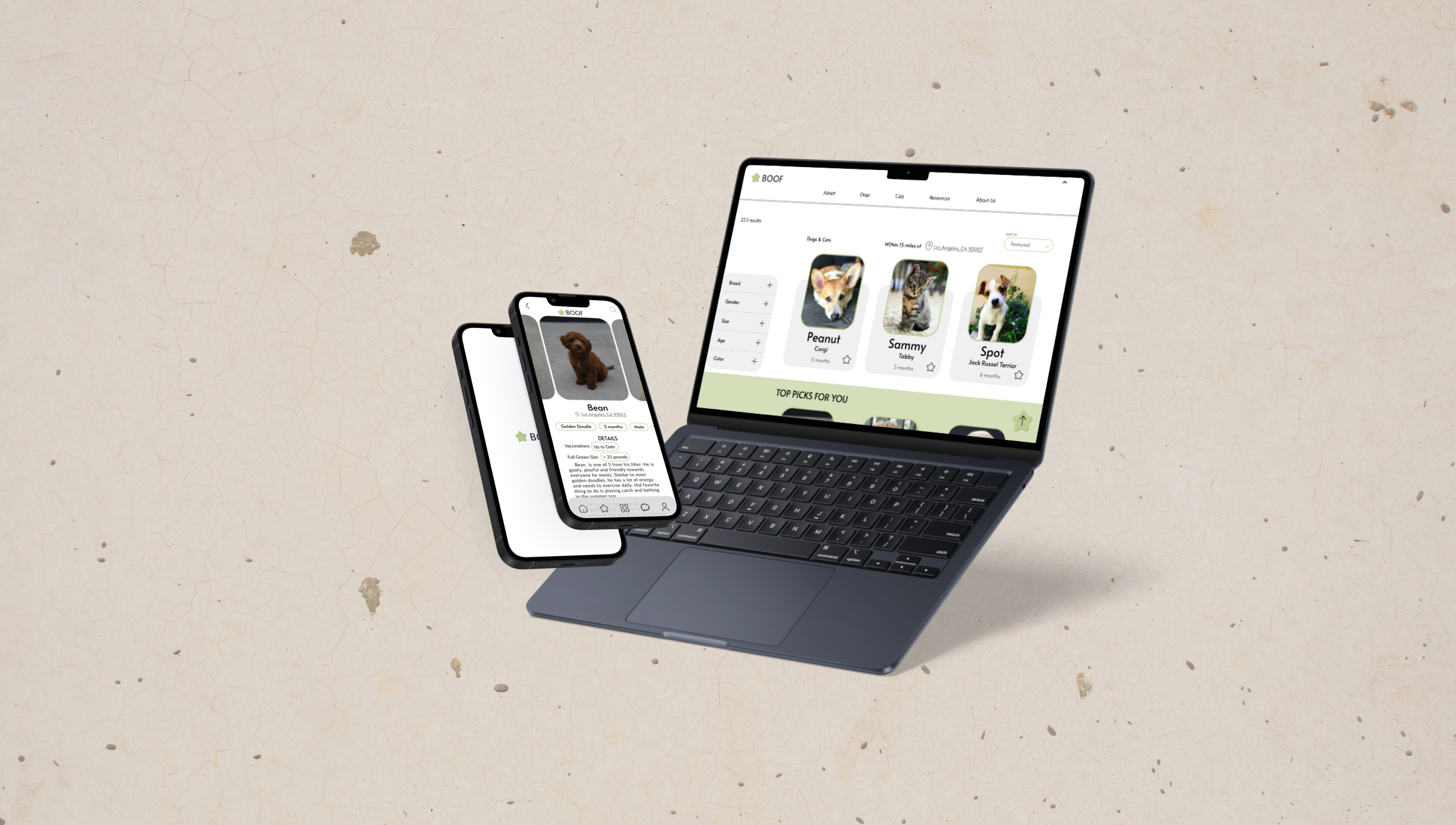
After the usability study, I decided to change the following items:
1. Replacing emphasized text from green to black with weight increase
2. A feature that allows users to sort listings (new to old)
3. Increasing the font to have a minimum of 16px
4. Ensure that all text has contrast with the background
.png)


.png)
.png)

.png)

.png)