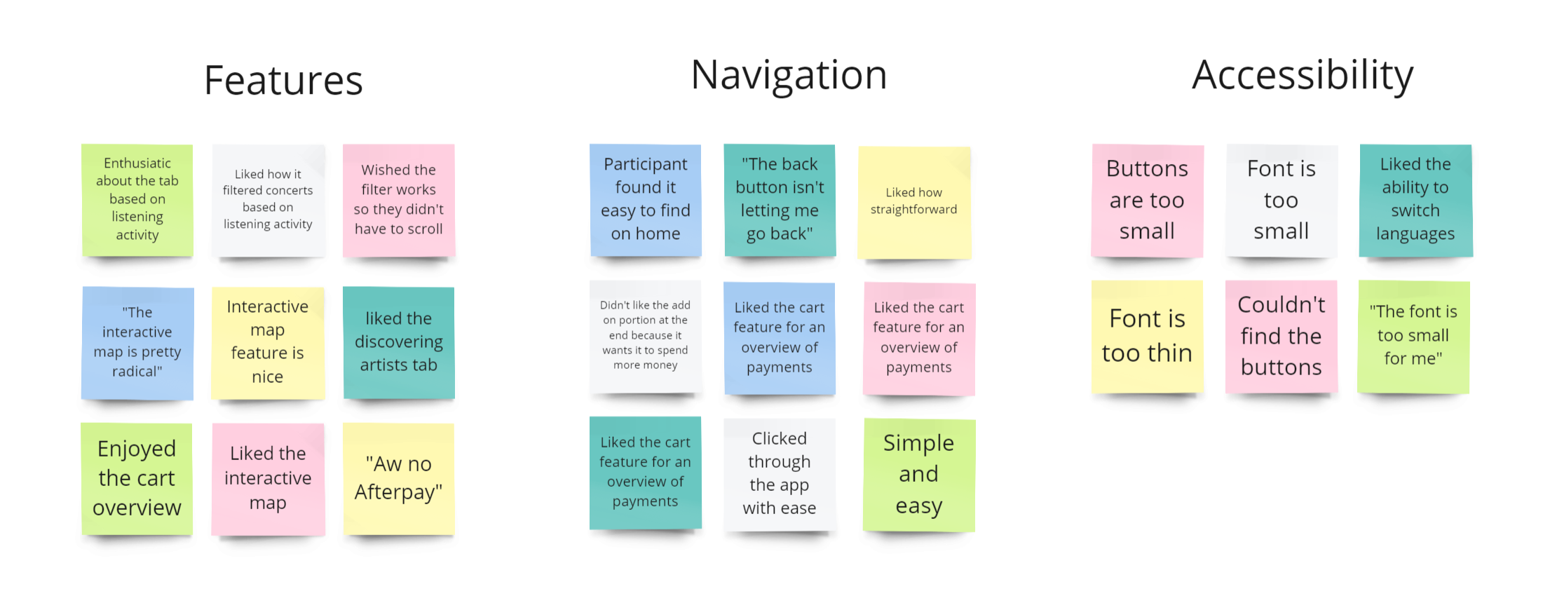
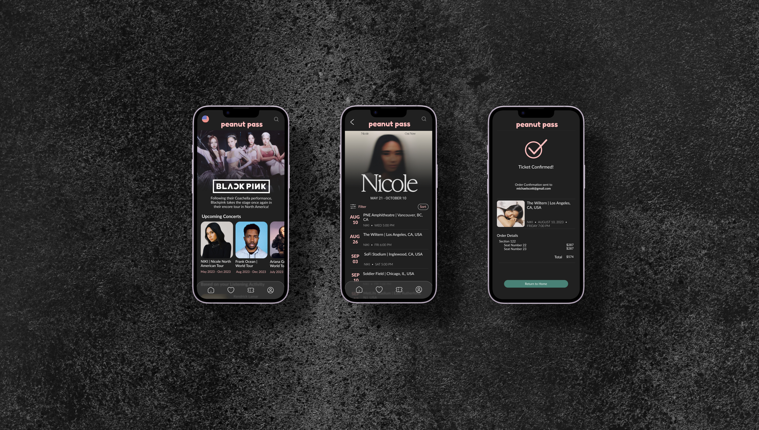
Peanut Pass

Peanut Pass

Jun 2023 - Jul 2023
Designing a Concert Ticketing app for Trendy Musicians
UX Designer
Figma
peanut pass final design
Peanut Pass is a mobile app that makes ticket purchasing simple and efficient for users. Seating arrangements are made easier with an aerial and perspective view for users before they select their seats. The targeted users are individuals ages 13+ who have an interest in attending concerts. 
The Problem
Over time, purchasing concert tickets has become more and more complicated. Busy individuals do not have the time to wait in queue and book tickets.
The Goal
Design an app that enables all individuals to select preferable seats, book tickets, and enjoy the concert, hassle-free.
Overview
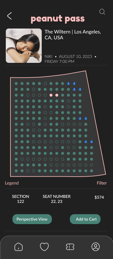
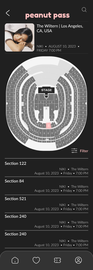
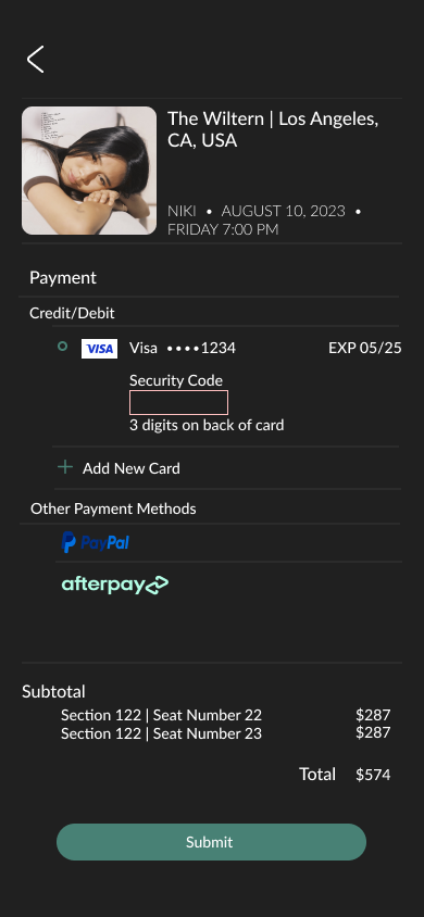
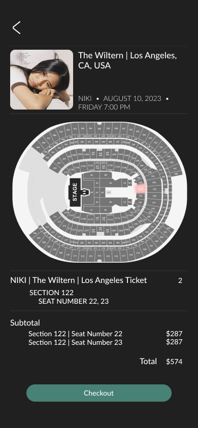
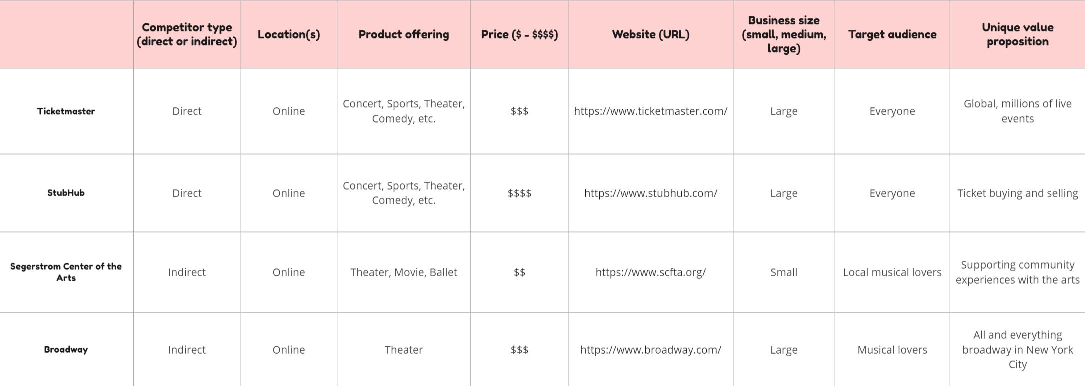
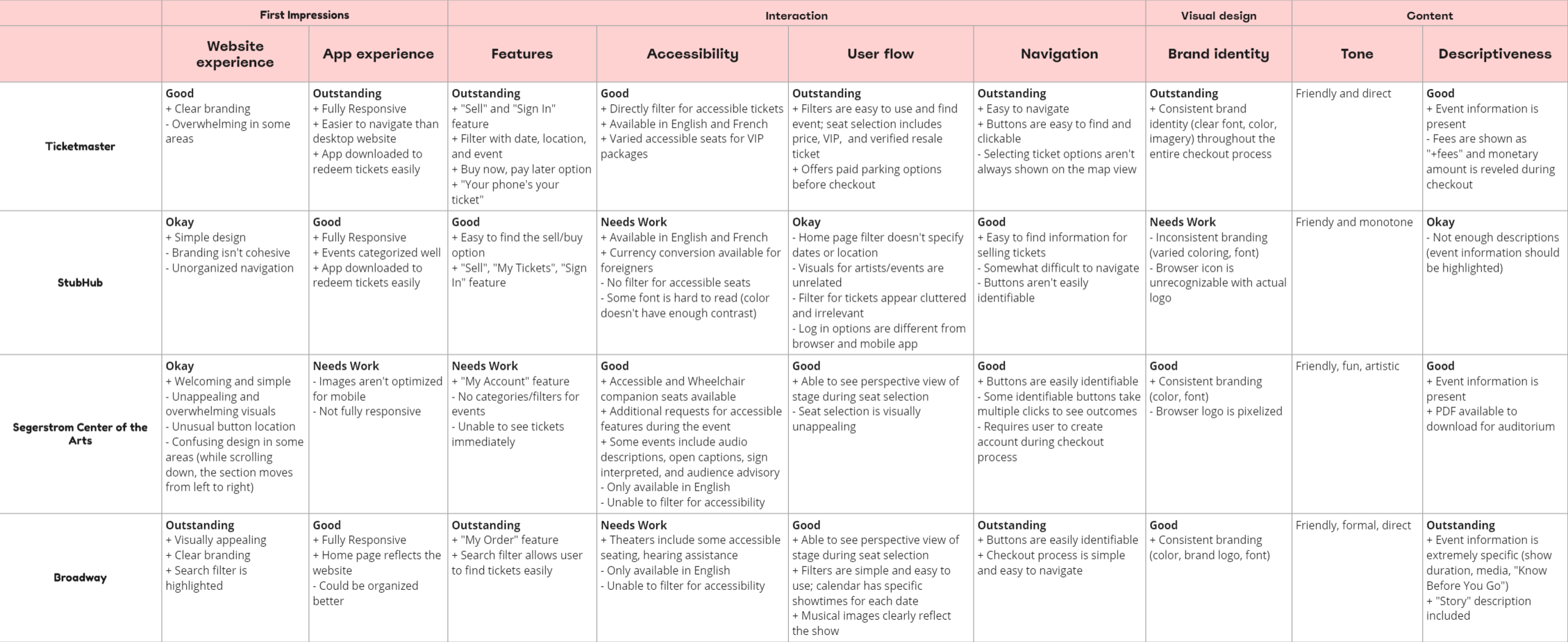
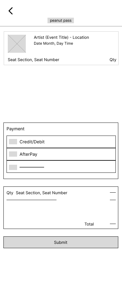
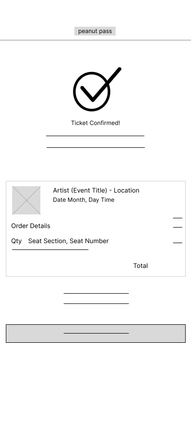
I based user research on several pain points. I conducted interviews and empathy maps to identify user needs. The primary user group identified as individuals with a working schedule who weren’t available to queue for concert tickets. As more research was conducted, I discovered that individuals also had issues with selecting seats from an aerial view, payment options, and accessibility. Overall, these attributes were based on issues with time, seat selection, and accessibility.
User Personas
user persona for mary
Problem Statement: Mary is a full-time accountant who needs to be able to purchase tickets without having to wait in-queue due to her busy schedule.
user persona for justin
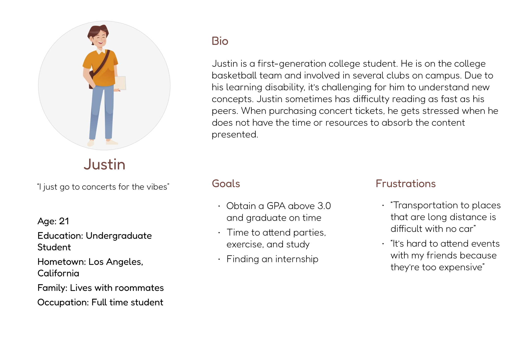
Problem Statement: Justin is a full-time undergraduate student with a learning disability who wants a platform with a simple ticketing process that doesn't overwhelm him with information.
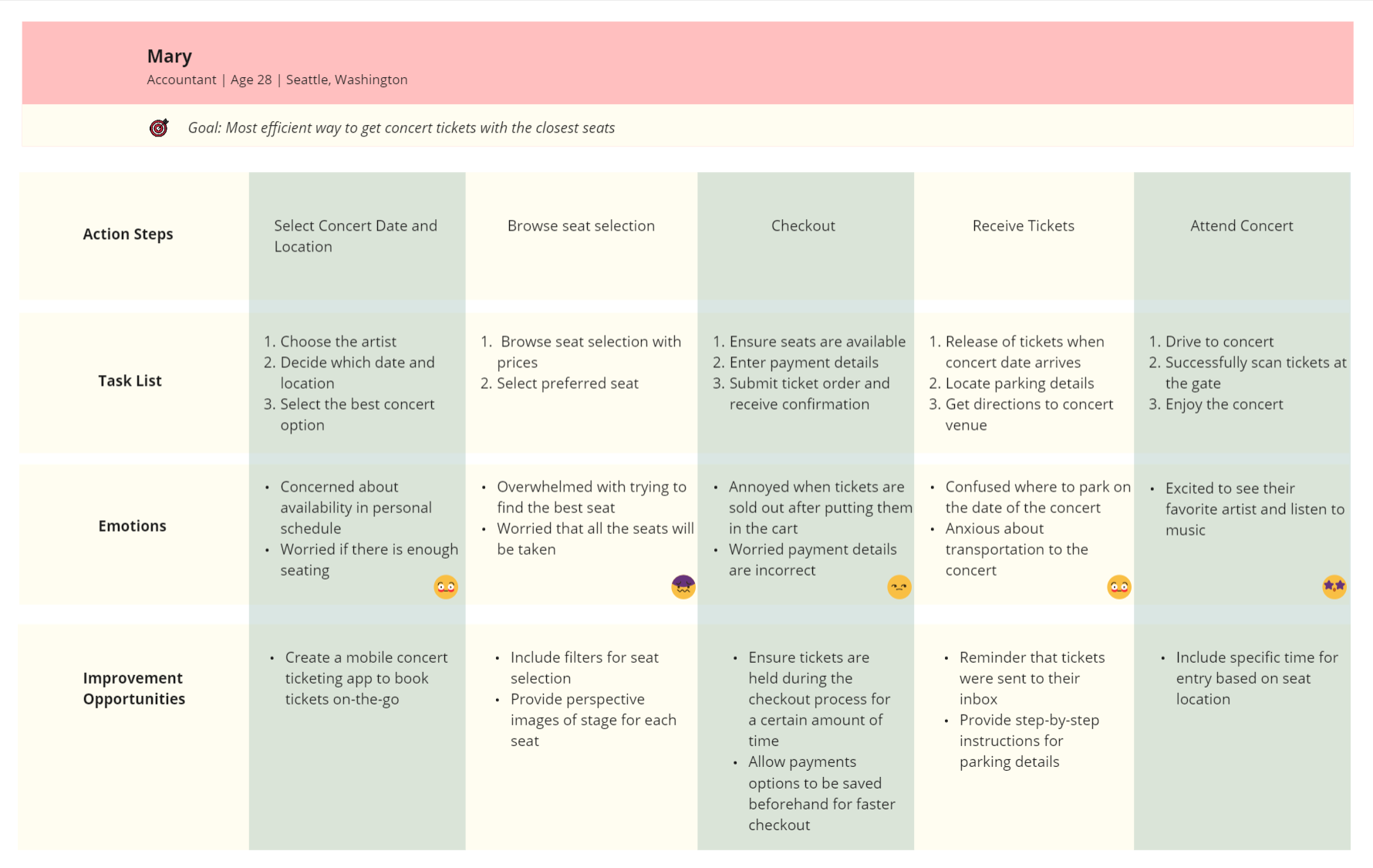
User Journey Map
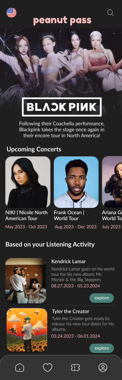
Mary’s user journey revealed that a concert ticketing app would be useful. 
user journey map image
I audited several highly-rated competitors that highlighted some of the gaps and opportunities for the Bean app.
competitor analysis for 4 different companiescompetitor analysis for 4 different companies
After mapping out the user flow and conducting a competitive audit, I did a variety of sketches of what the app would eventually look like.
Mobile
sketches for mobile app
With the help of my paper wireframes, I created digital wireframes and mapped out features. Some features I integrated were: a search bar in the center of the page for users to find events quickly, a language translator, aerial and perspective view of seats.
Mobile
homepage mobile digital wireframe
artists events page mobile digital wireframeseating selection page mobile digital wireframe
seating selection map page mobile digital wireframecart page mobile digital wireframe
checkout page mobile digital wireframeconfirmation page mobile digital wireframe
With digital wireframes, I created my low-fidelity prototype.
View Mobile Low-Fi Prototype
Mobile
homepage mobile mockup
artist events page mobile mockupcart page mobile mockup
seating map page mobile mockupcheckout page mobile mockup
section map page mobile mockupconfirmation page mobile mockup
Study Type
Unmoderated usability study
Location
USA, remote
Participants
6 participants
Length
15-30 minutes

Key Findings

These were the main priorities that users pointed out:

1. Navigation

The buttons were too small for some users liking. Some had issues with locating buttons and returning to previous pages.

2. Accessibility

The font was not easily readable for some users; there were problems with the size and weight.

3. Features

Many users enjoyed the features: interactive map, cart overview, and discovering artists section. Some users mentioned that their experience would be improved if filters and Afterpay were added.
usability study insights
After the usability study, I decided to change the following items:

1. Enlarging text size and weight

2. A filter for sorting event dates, artists, locations, prices, etc.

3. Altering buttons to make them more visible

4. Ensure that all text has contrast with the background

Mobile

artist event page mobile mockupsection page mobile mockup
seat selection mobile mockupcheckout page mobile mockup
cart page mobile mockupconfirmation page mobile mockup

Mobile

View Mobile Prototype

or view above!

What I learned:

Different users have various perspectives on user experience. It was challenging to make decisions that would be best for all users when each individual had different preferences. I learned that designs will never truly be finished; iterations can always be made as the world and people are always changing.

Next Steps

1. Conduct more usability studies and improve the accessibility aspect of the app to improve the user experience for all users

2. Collecting user research to see if more features would make the app better

3. Add a page for animals who have been listed for an extended period of time to promote adoption for older animals.
carrot icon